Research shows that traditional anti-harassment and discrimination training methods are ineffective and outdated. We wanted to try a new approach.
Focusing on people’s simillarities rather than their differences, we implimented a series of easily digestible 10-minute training episodes. Employees and managers can engage with training through beautifully deisgned UI, inspired by Instagram stories.
Challenge
Knowing that traditional anti-harrasment and discrimination training methods are ineffective and outdated, we needed to try a new approach. We implemented a series of 10-minute episodes for Employees and Managers with a beautifully designed UI and engaging content.
This harassment prevention training focuses on people’s similarities rather than their differences; avoides accusing particular groups of problematic behavior and offers diverse, nuanced examples rather than cliched, outdated ones.
Constraints
This ambitious project had a very tight timeline. All twelve 10-minute episodes, from concept, UX writing, design and development of an entire Progressive Web App had to happen simultaneously and go-live at the end of a grueling 8-week sprint.

Additionally, our passionate international team hadn’t worked all together before, was distributed across two continents, and separated by a 9-hour time difference. 😱
My Role
I created and implemented the frontend code in React, which included: UI, story-style screens, API integrations and numerous interactive elements.
In addition to my technical contribution, I collaborated with the content team for many of the training episodes, but especially regarding gender identity, which, as you might have guessed is very important to me.
Interesting UI elements
⌁ Minimum time requirement
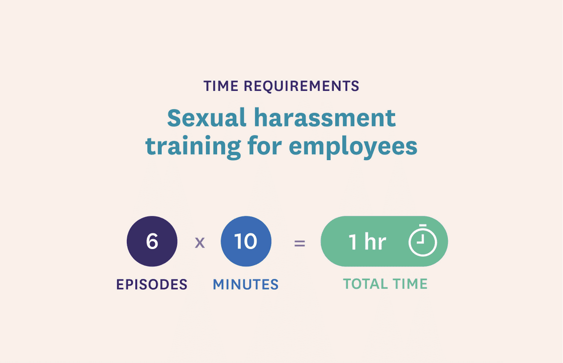
To satisfy legal training requirements, each user needed to spend a minimum of 10-minutes in each episode to gain compliance with US state laws.
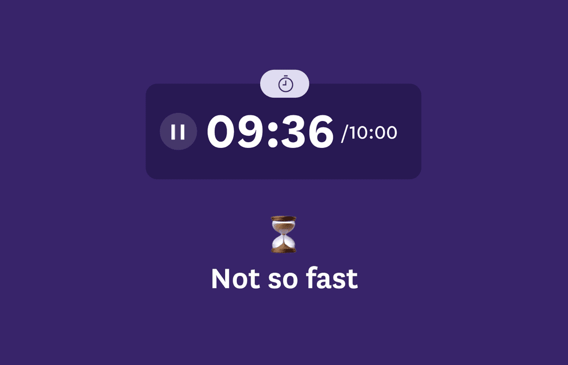
We implemented a timer that thwarted users attempting to “set it and forget it.” If a user was inactive for more than 1-mintute, the timer paused the countdown and displayed message to resume.
All “continue” CTA’s loaded after 3-seconds (the average reading speed per page), discouraging the user from swiping through the episode without consuming the content.


Additionally, if the user completed the episode in less than 10-minutes, we introduced a timed-gated modal that would ask them to go back and review until they had reached the required time.
⌁ Theme switching
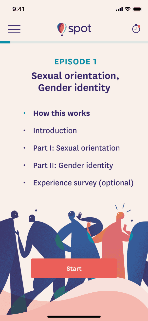
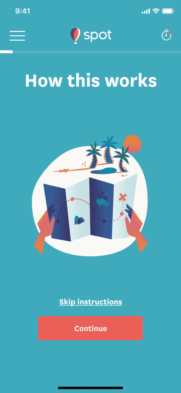
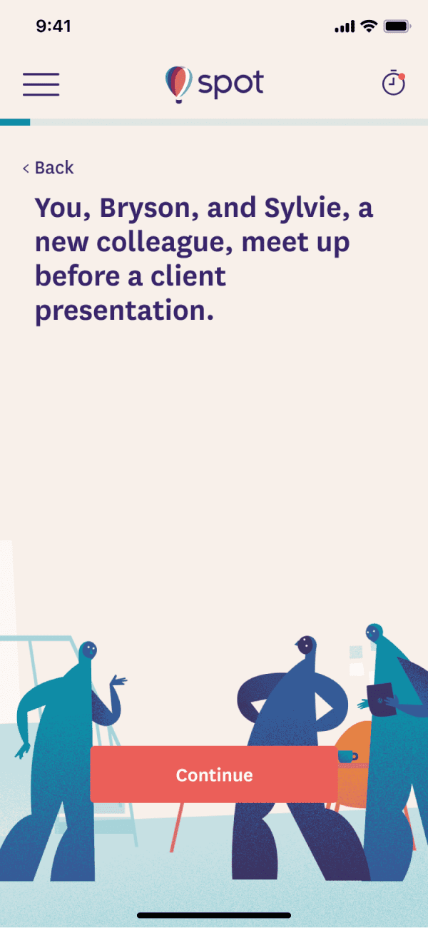
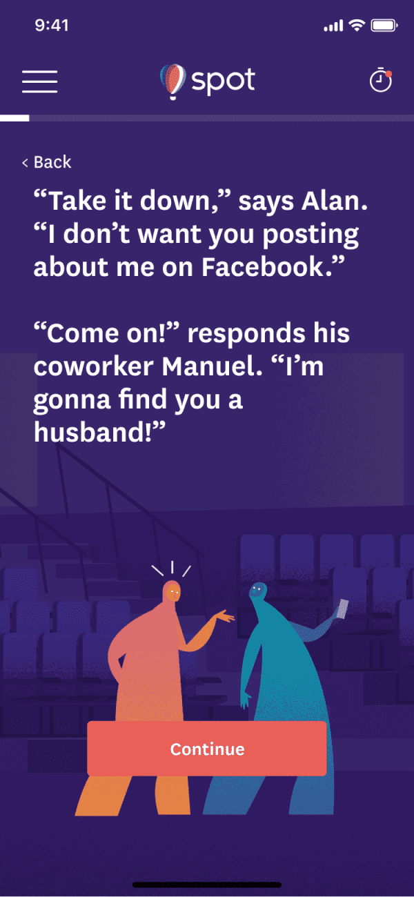
We implemented a handy theme switch so that we could change all elements’ colors dynamically, according to where the user was in the flow.
⌁ Comprehension and NPS surveys
Different types of UI were implemented to survey users:
Comprehension
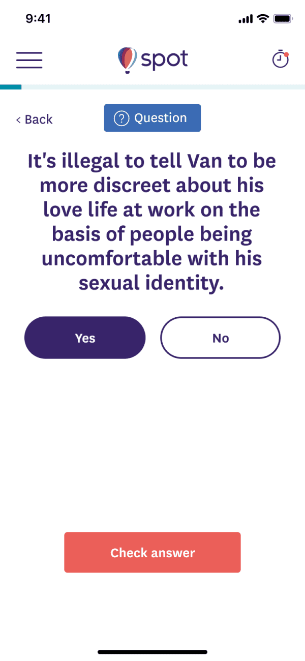
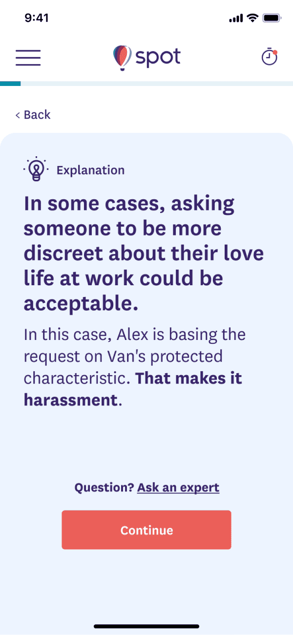
During training, we were required to test users’ understanding of the content and knowledge around the law. We met this challange by asking users to respond to questions directly following neuanced scenarios. This was not a pass/fail test, but a way to offer more information around the legal definitions surrounding workplace harassment and discrimination.
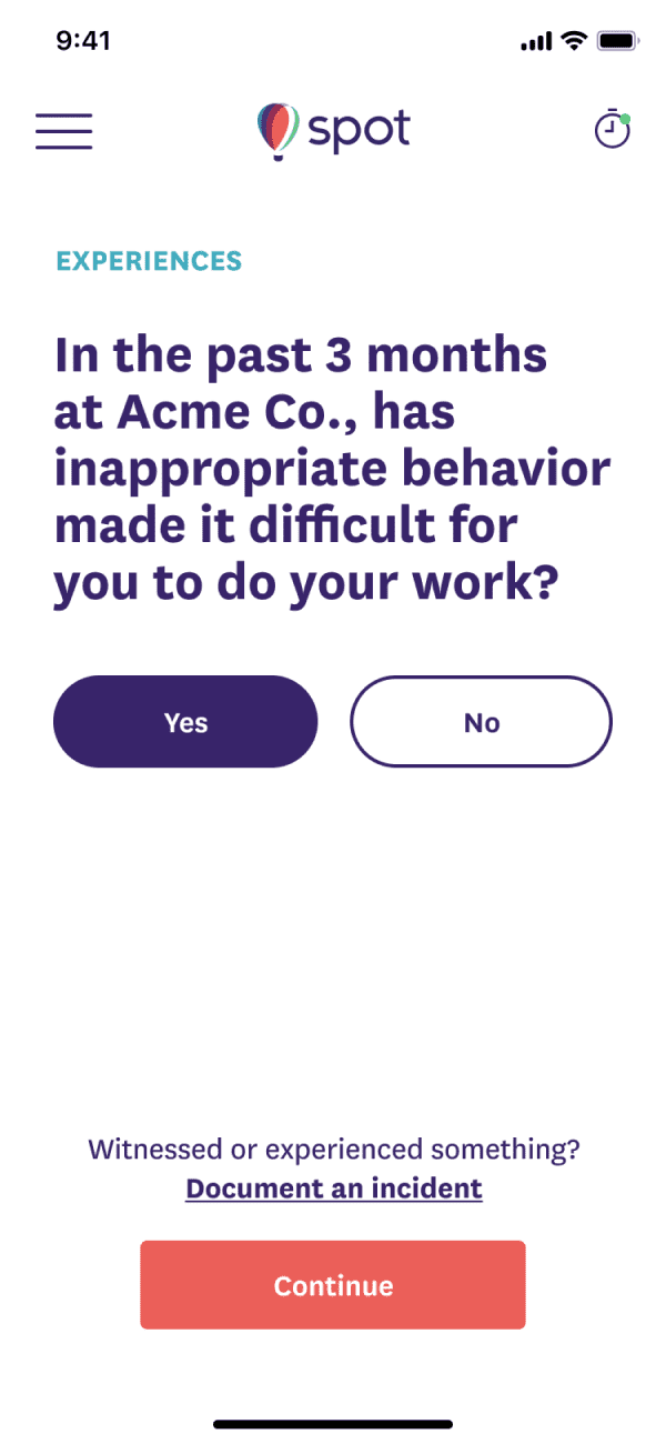
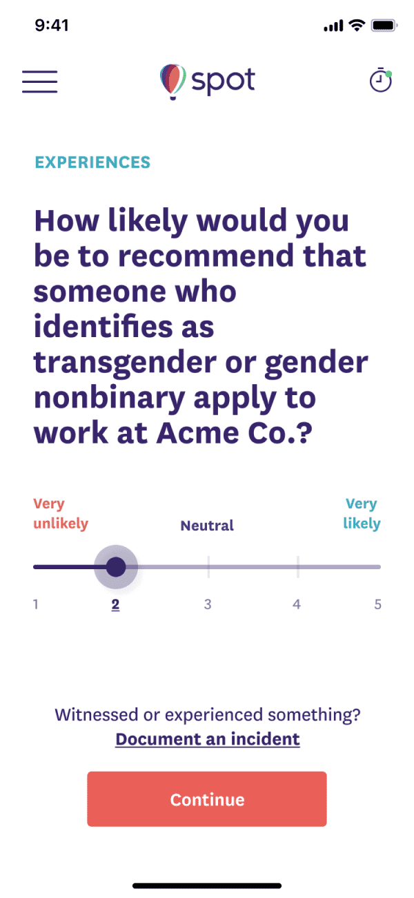
NPS Surveys
After an employee completes an episode of training, we survey them about their experience regarding the topic to gather information and bench mark internal culture. If they answered “yes” to any of the survey questions, we offer them a way to anonymously provide feedback, or escalate a formal anonymous report to their HR team.
The Result
We shipped training on-time, and it was an overall success. Spot was able to aquire new clients, and engagement stats exceeded expectations. 🎉
Team composition
San Francisco, USA <> Berlin, DE
Content
Jessica Collier, Lisa Sanchez, Kelly Chen, Paige Siez
Product
Daniel Nicolae
Project Manager
Gloria Lu
Design
Micah Rivera
Development
Cy.wtf, Ayham Kteash, Dylan Marriott